Form takes precedence over functionality in this beautiful basic cycling computer, but it executes its limited feature set well and is a stylish entry-level option.


A work of beauty
The CatEye Quick is a basic bike computer. It doesn’t have GPS, and it won’t connect to your phone. Once a ride is done, it’s gone. This is an old-school bike computer, magnet on the spokes and all. The sensor on your forks is wireless with a short range, and that’s it.
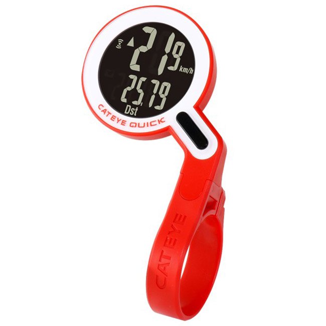
That’s a roundabout way of saying this: it’s all about the aesthetic. The Quick is a unique out-front circular-faced head-unit that goes deep into postmodernism with its mid-century retro styling and 1990s retro LCD functionality.
That’s not exactly a saturated market. Its closest counterpart is the equally postmodern Omata One, an analogue dial-based GPS unit that’s ten times the price and much bigger and heavier. The Omata definitely has it on looks—its retro speedometer design is spectacular. But the Quick is a looker too. And its inverted LCD screen both stands out from the crowd and provides awesome readability.

CatEye have made a few color options for the Quick. The US and EU markets got a few variations all featuring red, white, and black, though some Japanese models are more colorful. For me, it looks just atrocious and silly in anything other than all-black.

The Quick’s aesthetic might not be to everybody’s taste. It doesn’t look worlds apart from my ukelele tuner, now I think about it.

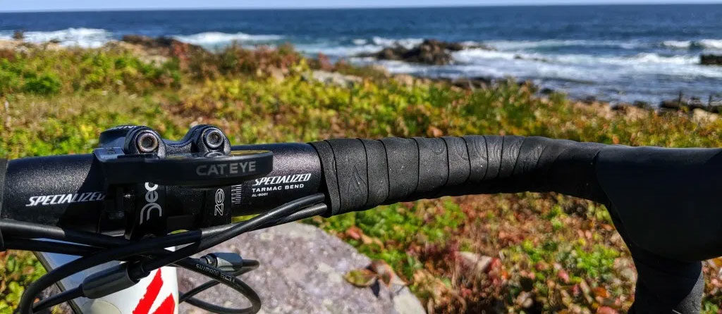
Still, I think it looks beautiful on my bike, and it really does stand out. Smartwatches have been tackling the circular screen issue for a few years now, but none of that tech has made it to the bike yet. It really should.
It looks great. It’s certainly unique. But it doesn’t do much. So why would anybody use it?
The case for downsizing
Back when GPS computers emerged, a big part of their appeal was that they recorded your ride path and its data, where magnet-based units were really only useful for live data. They did keep limited post-ride data that you’d need to manually enter into your spreadsheets if you didn’t want it to disappear into the ether at the end of your ride, but that was an inconvenient and inelegant way of keeping track of your cycling.
We’ve since reached a curious inverse of that situation, where anybody can record a ride using their smartphone, but actually seeing their live data requires a dedicated device or haphazard smartphone mounting solution. And honestly, a traditional magnet unit on the handlebars combined with Strava in the back pocket is a cheap and easy way to bridge that gap for people who don’t need to see more complex data while riding. This makes it a great entry-level solution for people currently riding with naked bars, but it’s perhaps a harder sell to downsize from a GPS unit.

Downsizing isn’t the worst idea though. Most people will already ride with a phone in their back pocket, so recording to Strava is just as simple as ever, and in the case of live tracking, also more reliable. Simplifying your ride away from complex data points is also kind of liberating, and after using the Quick I think it could be a compromise I’d entertain for my more simple rides.
It’s downsizing in a literal sense too: it was a surprise how small the package was when it arrived. Surprising, too, was the weight of the device, as well as how small a footprint it has on the bike considering its large screen. Bike computers are getting bulkier and bigger with every passing year, and it was refreshing to swap out the Hammerhead Karoo and its oversize mount for something so small and light. At 24g all-in, the Quick is less than half the weight of the Karoo’s mount alone (55g), and a tenth of the Karoo’s weight when mounted on the bike (241g). It’s actually a difference I can feel in the bike’s handling.
Some of this size and weight is displaced, of course. This is analogue technology and as such requires a magnet on your spoke and a sensor on your fork. The sensor is wireless, so it’s not a terrible inconvenience, though it is a downer to install after the initial sleek first impression of the Quick itself. The sensor’s CR2032 battery is good for 10,000km, which at least means you won’t be changing it very often, and CatEye claims the Quick will even tell you when the battery is getting low. That’s not something I’ll be able to verify any time soon.
And battery life was actually another unexpected “downsizing” moment. The head unit itself runs off a small CR1616 battery, and has an estimated battery life of one year. It’s genuinely liberating not to have to think about whether you charged your device before you set out.
Riding with the Quick didn’t actually feel like much of a downgrade at all. I already take a phone with me when I ride, so recording the ride with the Strava app (or similar) is just a matter of hitting start on a different device, and post-ride it really doesn’t feel any less convenient than syncing to Strava from a head-unit. There’s no sensor support or navigation, but I’ve found that I don’t really notice their absence when riding with the Quick. At least, not until I start training more seriously again or get sent out to the middle of nowhere with my bike again. Most serious cyclists do need rich data for training, but, like me, probably overestimate exactly how often they really use it.
That’s not to say that downsizing is for me. The data I get from rides is valuable in understanding and improving my fitness, and I’ve ridden in enough new states and countries now that the importance of navigation is etched on my brain. Still, it’s been a carefree experience to cut loose from the backlit screens, and it’s truly hard to think of a more suitable device for those “I’ll just ride 20 miles around the island” days.
Features (or lack thereof)
The Quick has just seven data fields. In a world where other GPS bike computers get more data fields added in a single software update, such a limited feature set unsurprisingly feels paltry. This is a basic device in terms of functionality, and many other cheaper options exist that can give you the same data.
But it’s not like CatEye have overpromised on features. You’re paying for the aesthetic. It’s an experiential device that’s well-built and does what little it promises very well.

You can see two data fields at once, one of which is always Current Speed. You can cycle through the others by tapping the Quick’s button. Your options are:
- Current Speed
- Average Speed
- Maximum Speed
- Trip Distance
- Total Distance (Odometer)
- Moving Time
- Clock (Time of day)
There’s also a “pace arrow” that indicates whether your average speed is rising or falling. I’ve tried to convince myself this is a useful feature in hilly time-trials when testing other devices in the past, but the reality is that I just don’t find it helpful. Still, it’s there if you’re a believer.
Specs
| Current speed: | Up to 99.9 km/h (62 mph) |
| Total distance (Odometer): | Up to 99999 km |
| Trip distance: | Up to 999.99 km |
| Moving time: | 0:00’00” – 9:59’59” |
| Average speed: | Up to 99.9 km/h (62 mph) |
| Maximum speed: | Up to 99.9 km/h (62 mph) |
| Wireless transmission: | Speed |
| Clock: | 0:00’~23:59′ |
| Pace arrow: | Yes |
| Auto power saving: | Yes |
| Auto start/stop: | Yes |
| Odometer manual set: | Yes |
| Tire size: | 100mm~3999mm |
| Battery: | Computer: CR1616 X1 Sensor: CR2032 X1 |
| Battery life: | Computer (1hr per day): 1 year Sensor: 10,000 km [6,250 miles] |
| Dimension / Weight: | 93.5 X 54 X 36mm / 24g |
First-Time Setup
First-time setup is surprisingly quick and easy. Attaching the mount to your handlebars takes seconds with an allen key, and the Quick clicks in from above. A latch underneath lets you remove the Quick from its small out-front mount. In fact, the Quick and its mount combined are smaller than a Garmin mount alone, and without the unit attached nobody will even notice that the Quick’s mount is still on your handlebars.

You’ll then set up the head-unit itself. It has a single Options button on the front, in the location where it connects with the mount, and a secondary Menu button hidden on the underside of the device. Using both buttons, you’ll need to set wheel circumference (it defaults to 700×23 and is easy to set to other regular wheel sizes), imperial or metric measurements, and the current time. Even with this rudimentary interface, this setup process takes less time than some GPS head-units spend booting up (though the wheel circumference setting could involve a lot of clicks if you’re running a frankenbike).
You’re not done yet though. The unit won’t work without its sensor. You’ll need to attach the magnet to one of your spokes using its built-in screw mechanism. Then you’ll need to attach the sensor to your front fork using the rubber bung and zip ties. This is the slowest and fiddliest part of the entire set up process, but still only takes a minute or two. With a 70cm wireless distance, you could feasibly put the sensor on the back wheel instead. You’d have to be a lunatic, but you could do it.
Hit the road
Setup was simple. Using the Quick is even simpler.
Tap the button to wake the Quick, then move to start recording your ride. Press the button when you want to change data fields. Hold the button to wipe your ride data (odometer excluded) at the end of the ride. When it’s time to stop riding, just stop riding and forget about it. The Quick will go into rest mode after ten minutes, then after an hour it will go to sleep until you next need it.
Accuracy
It’s difficult to measure raw accuracy without comparison to something else (even using a measuring wheel or map data means trusting in the accuracy of a third party), though a correctly-configured wheel circumference should always be more accurate for distance than GPS.
With that caveat in place, the Quick does appear to record accurately—it’s consistent in its data, which has always reflected the numbers I’d expect to see. And unlike a more complicated GPS system, it hasn’t displayed any erratic data whatsoever.
Running in conjunction with the Strava app in my back pocket, I’ve seen comparable figures across both devices at the end of a ride. The Quick gives more consistent distance reporting on the same route day-to-day, but there weren’t enormous differences that made me think one of the two devices was recording incorrectly. The Strava app is less accurate than a dedicated GPS unit (or at least, that’s how it’s supposed to work), but small errata and inconsistencies are still observable, if relatively insignificant, problems on high-end GPS units.

Verdict
I’ve focused on its drawbacks, but the Quick really is a great device. It’s simple, it’s accurate, it has a big, crystal-clear inverted LCD screen, and it has a tiny footprint on the handlebars.
CatEye have quietly upgraded their basic range with devices that look beautiful and have great build quality, and the Quick is the pinnacle of that effort. It mounts out front neatly, it has an inverted champagne LCD screen, and it has the retromodernist circular dial aesthetic that so few manufacturers even attempt (and seriously, Garmin should look to flat-out copy this if they ever revise the Edge 20/25 series). For a cheap bit of plastic using technology that the sport moved away from a decade ago, it’s strange to say that it feels aspirational. But it kind of does.

If you’re already considering the Quick, you probably won’t be disappointed, especially if you can find it at the $40 price point it often hovers around. But if the hardware doesn’t appeal to your sense of aesthetic or you want more than the 1990s bike computer experience, you’re unlikely to find anything that’ll convince you it’s worth the compromise.


